REB1RTH
*
REB1RTH *
REB1RTH started as a class project, but it didn’t stay there for long. What began as an assignment quickly evolved into something much more personal — a brand rooted in the idea of starting over, letting go of what isn’t working, and intentionally choosing a new direction. The concept of rebirth, to me, isn’t about perfection or having a clean slate. It’s about growth through discomfort, embracing change, and becoming something stronger because of the process — not in spite of it.
As I developed the project, it began to reflect my own mindset as a creative. Every designer hits phases of doubt, creative burnout, or feeling stuck. REB1RTH became a response to that — a reminder that evolution is part of the journey. You shed old habits, refine your voice, and rebuild with more clarity than before.
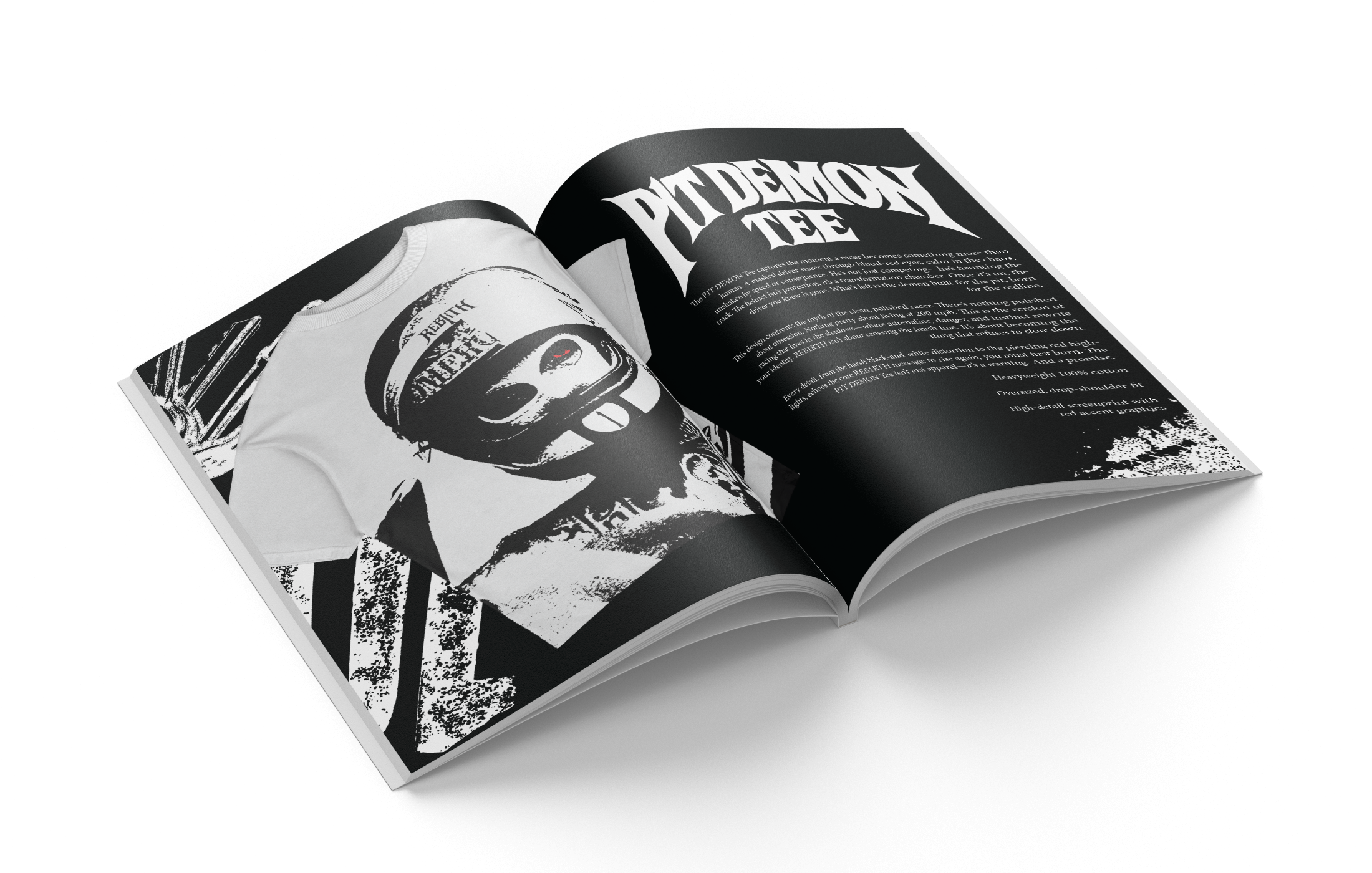
Visually, I leaned into expressive typography, sharp contrast, heavy negative space, and a gritty, worn aesthetic to reflect that transformation. Nothing about the brand is meant to feel polished or untouched. The texture, distortion, stretched letterforms, and bold type choices are all intentional — meant to feel raw, imperfect, and real. I wanted the identity to look like it had been through something, like it had layers and history, not something that came out perfectly on the first try.
I also explored how the brand could live beyond static visuals — imagining it on apparel, posters, and digital drops where the attitude and tone stay consistent. The name itself, stylized with the “1,” reinforces the idea of redefining something familiar and giving it new meaning.
REB1RTH gave me the freedom to push my style, take creative risks, and trust my instincts without overthinking every decision. It challenged me to design with emotion first and refinement second. More than anything, it reinforced why I love design — not just for how it looks, but for how it can communicate resilience, mindset, and transformation without ever needing to explain itself.