PRINTED LIKE ITS 99'
*
PRINTED LIKE ITS 99' *
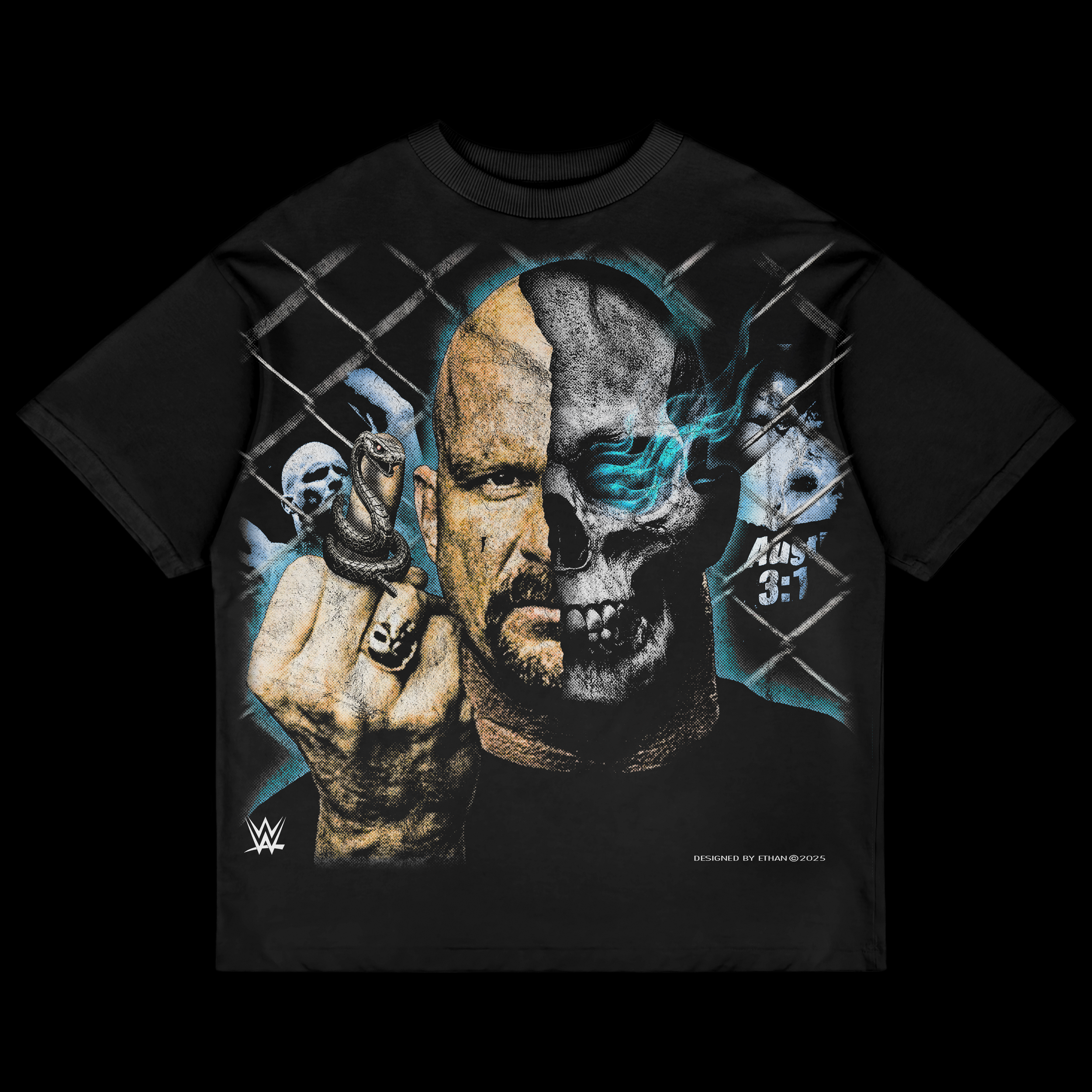
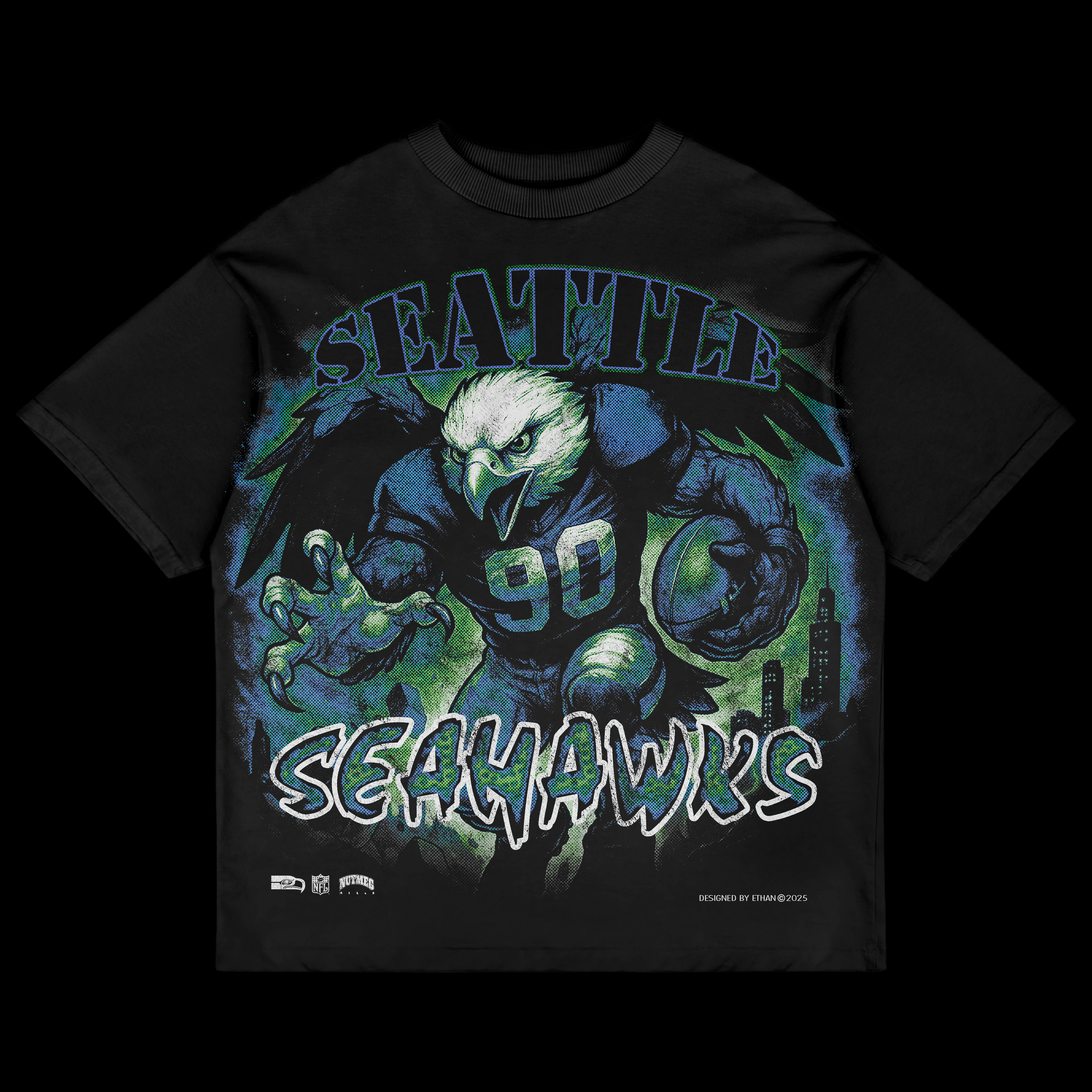
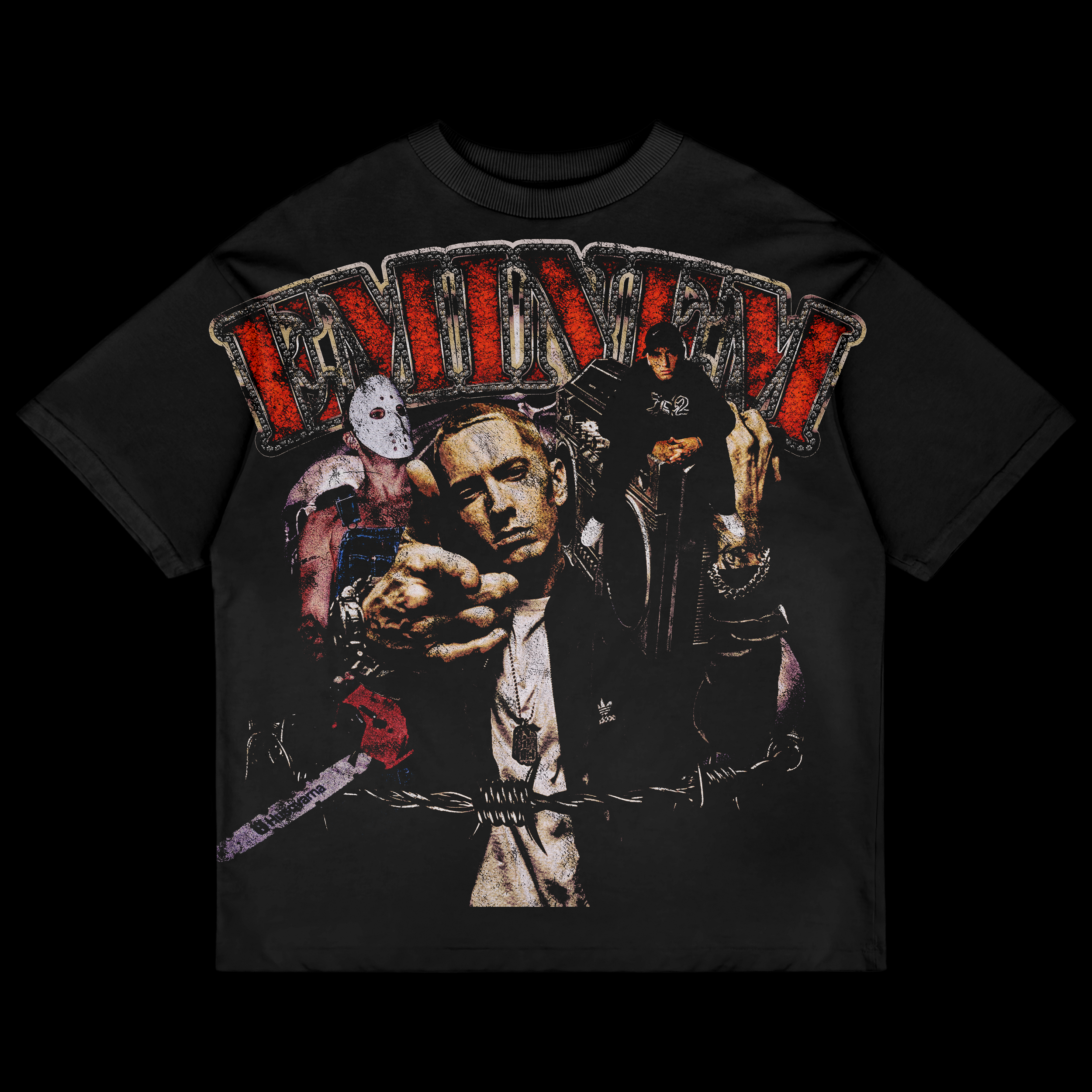
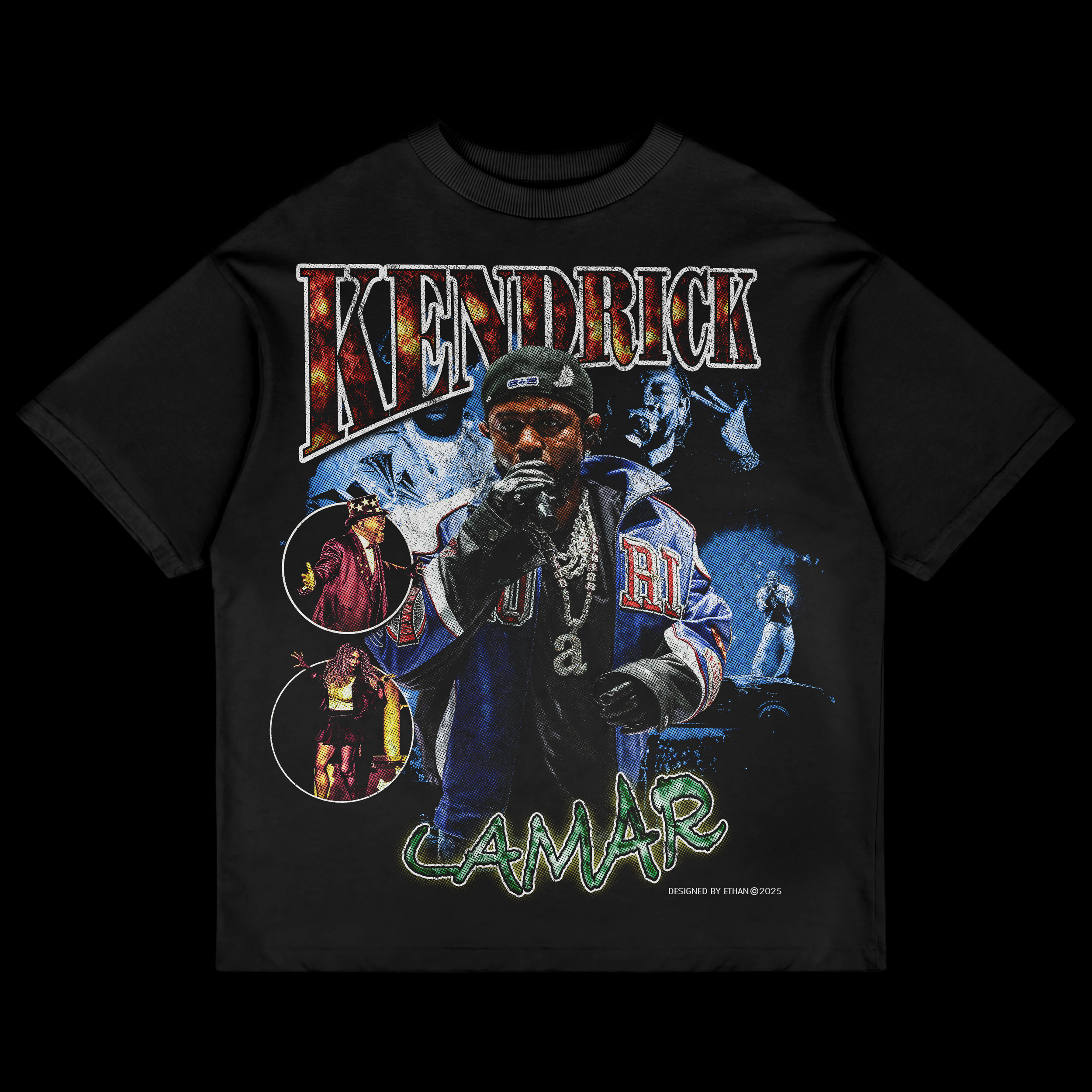
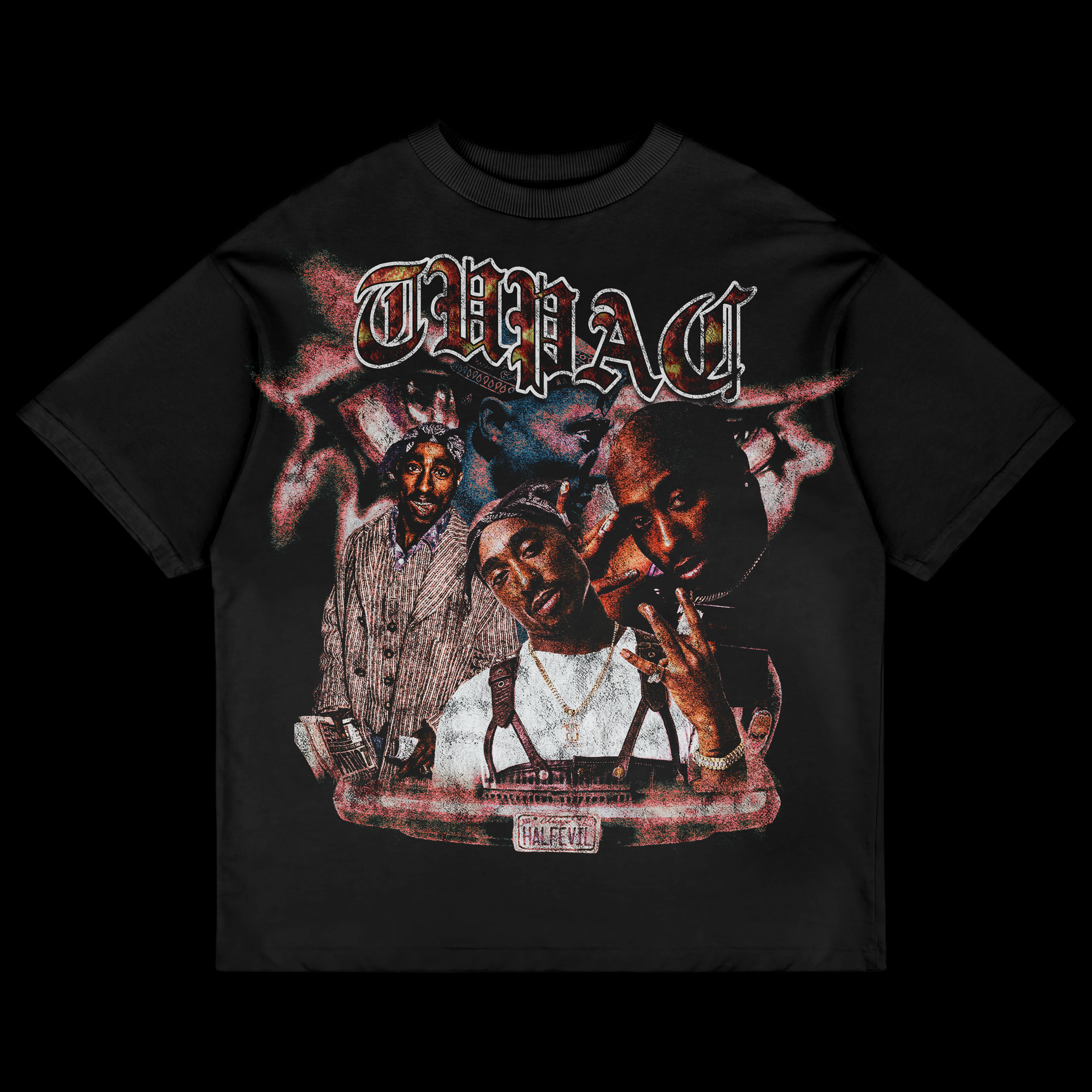
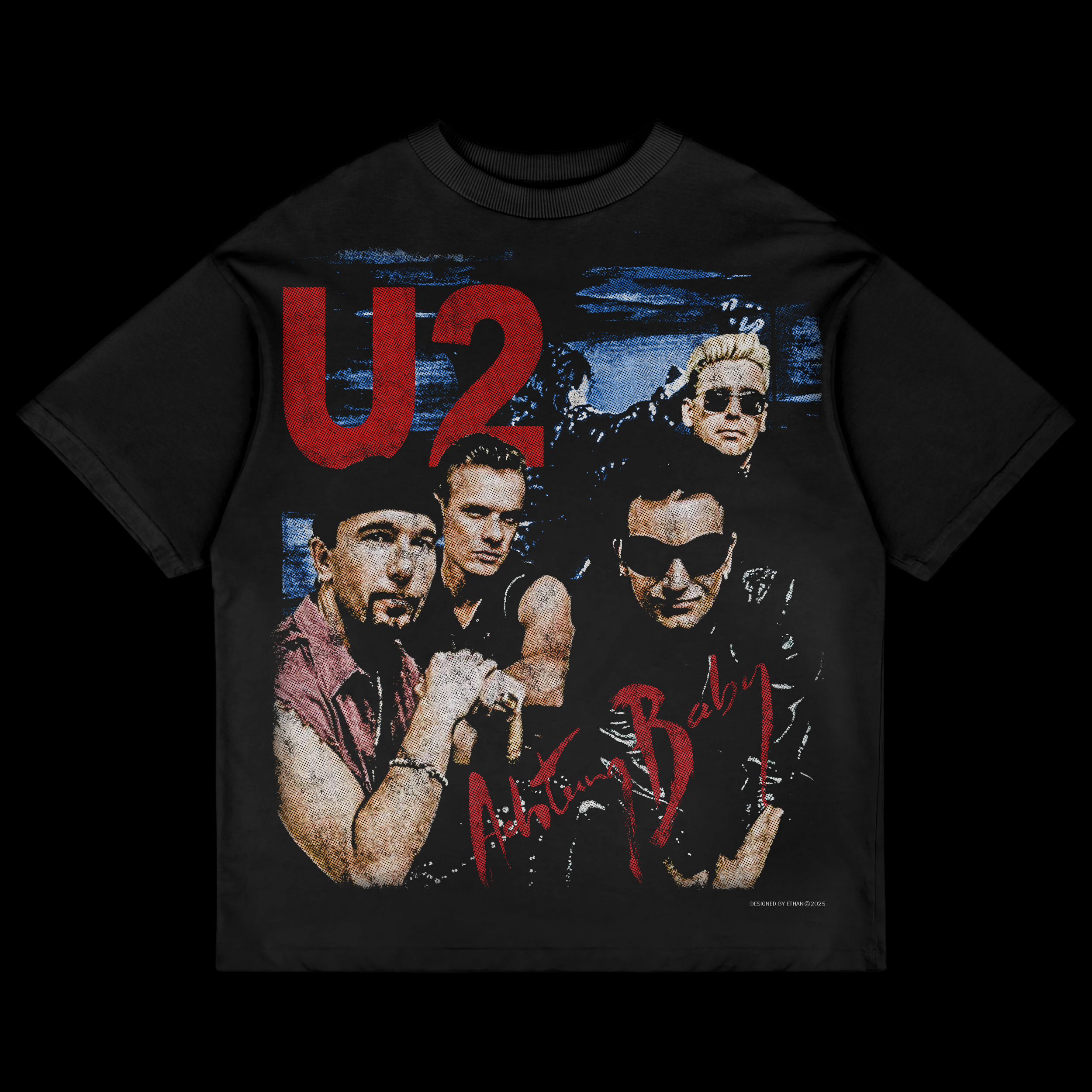
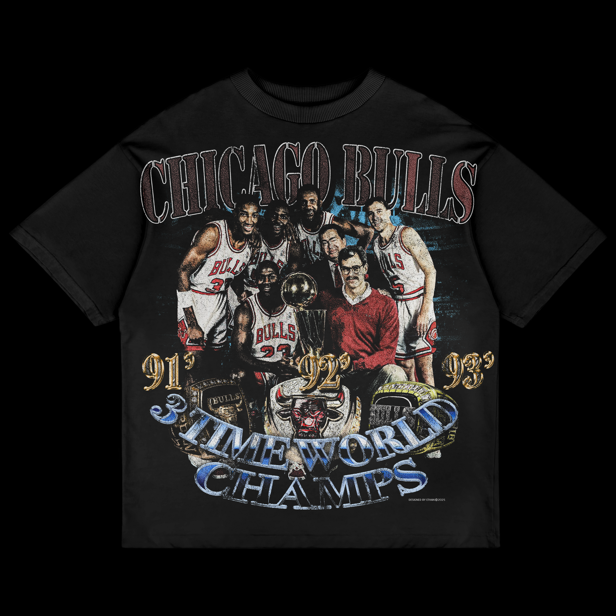
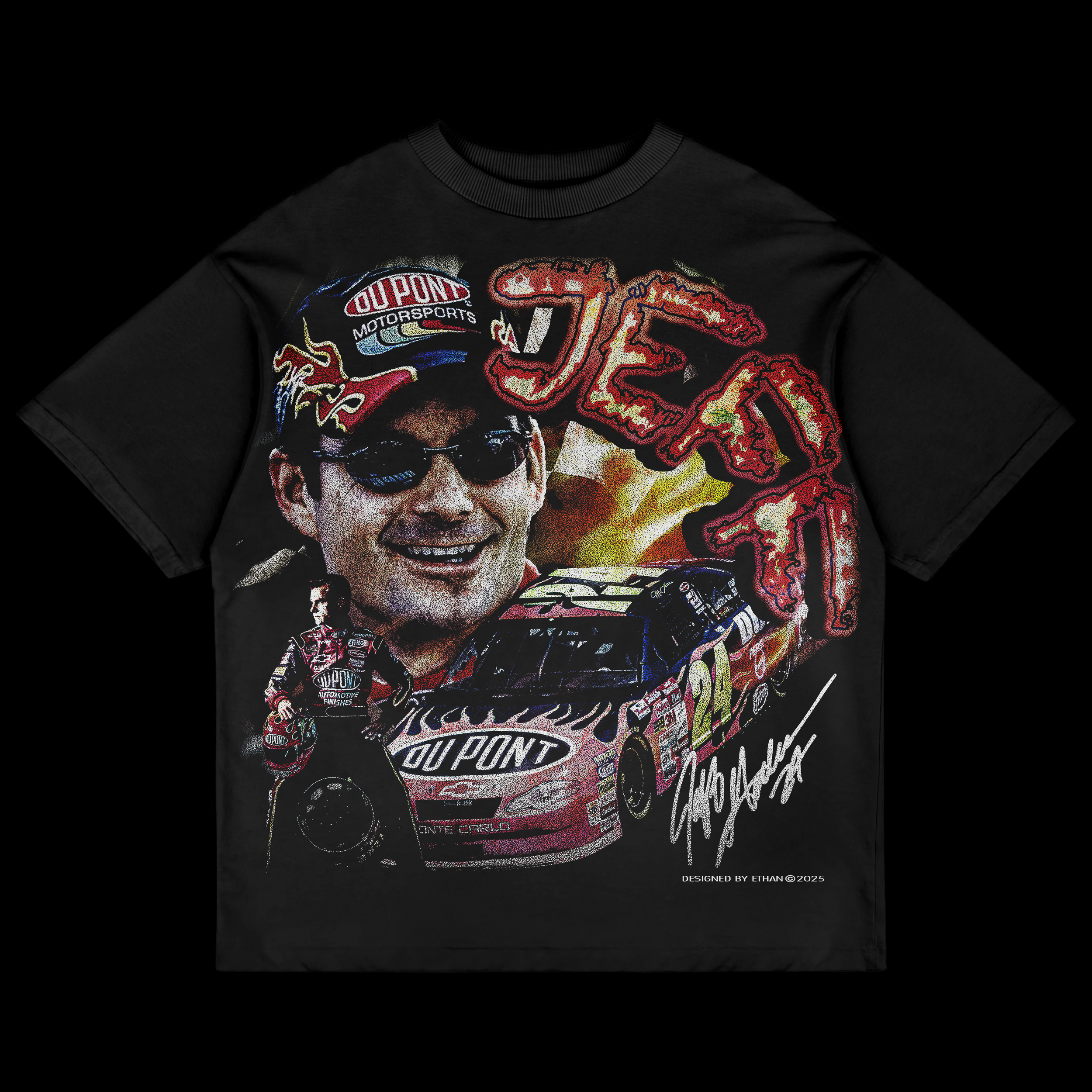
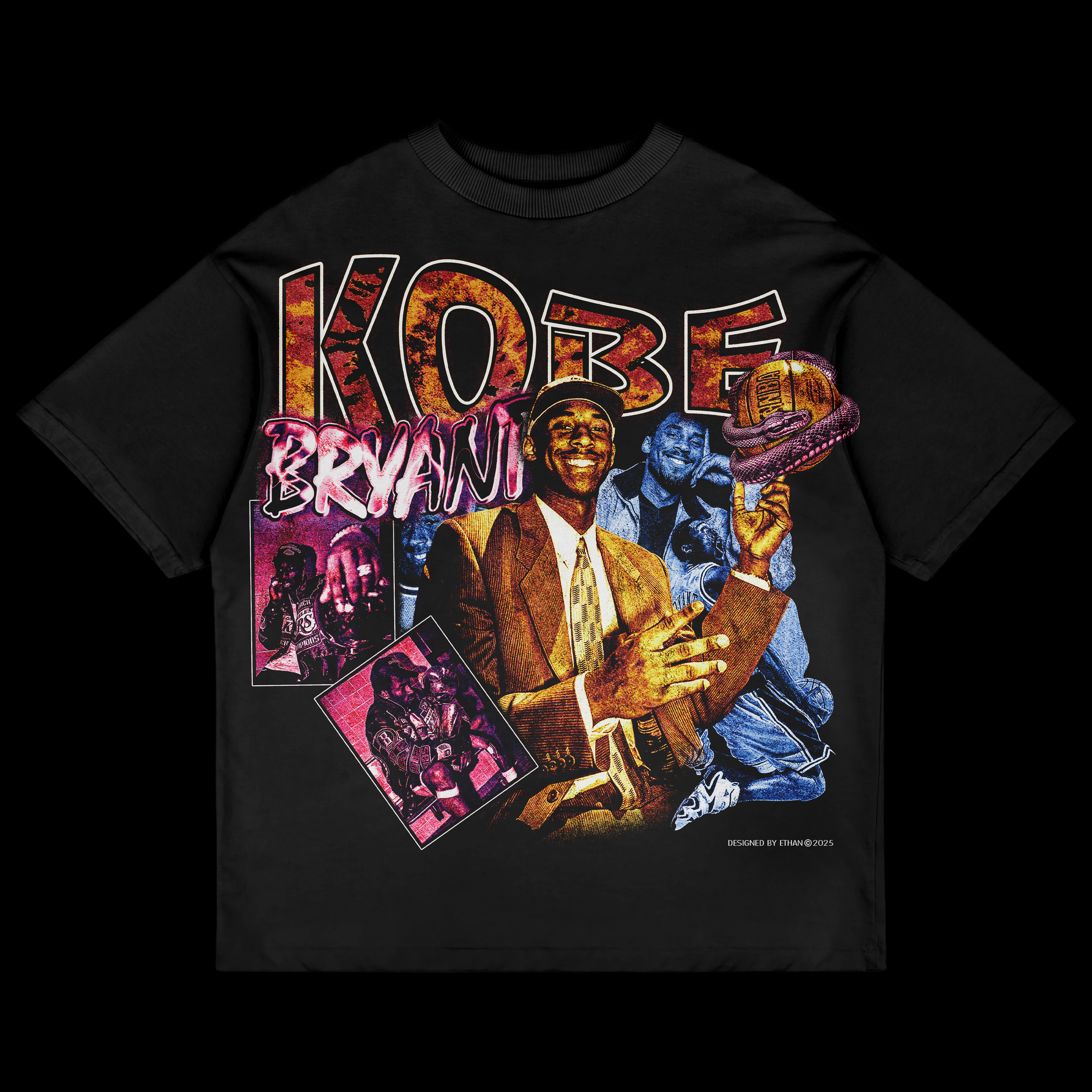
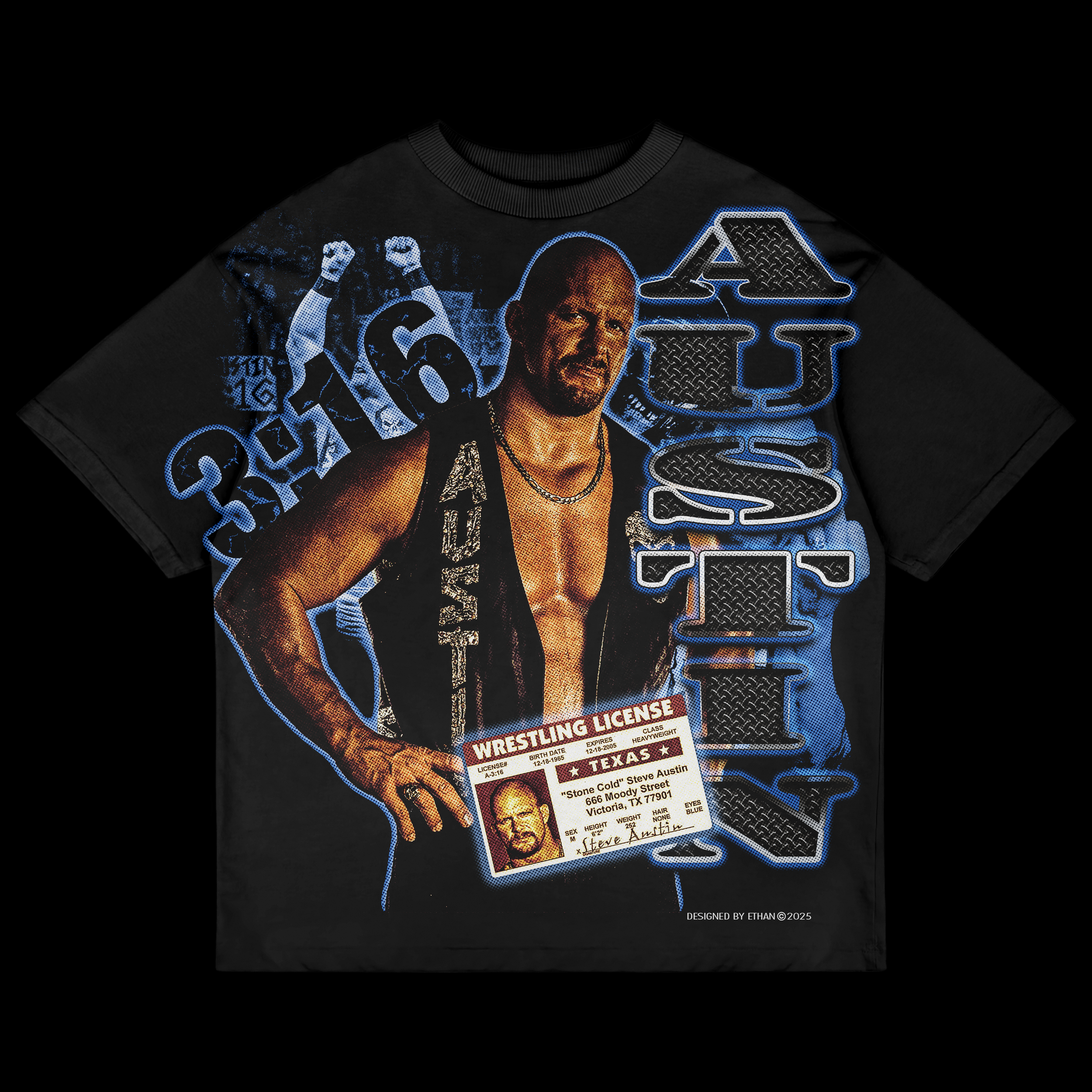
This section explores my love for ’90s-inspired graphic tees—bold prints, loud compositions, imperfect textures, and graphics that feel worn-in and pulled straight from another era. I’ve always been drawn to the energy of vintage tees from the ’90s — the oversized fits, the cracked ink, the slightly off-register prints, and the unapologetic typography that demanded attention. There’s a character to those pieces that feels different from a lot of what’s produced today.
These designs pull inspiration from vintage sports, music, and pop culture, but they’re always reinterpreted through my own lens rather than copied outright. I study what made those graphics work — the hierarchy, the color palettes, the distortion, the way type interacted with imagery — and then rebuild them with a modern understanding of layout and branding. It’s less about recreating the past and more about channeling its attitude.
I focus heavily on strong typography, gritty details, halftone textures, intentional fading, and subtle distressing to capture the look and feel of tees that have history behind them. The imperfections are never accidental. Every crack, blur, and rough edge is placed with purpose to create that authentic, lived-in feel — like something you’ve owned for years.
Each piece is designed to feel familiar but fresh, blending nostalgia with modern design instincts. It’s a space where I get to study the past, remix it, and build something new from it — graphics that feel expressive, culturally aware, and built to last. Just like the tees that inspired them, the goal is to create work that doesn’t just follow trends, but holds its own over time.